alex francisco :: designer pencil to pixel to people

More catalyst than pair of hands. I translate between creative, product and engineering so the design survives the trip into AEM, and the systems I leave behind work even when I'm not in the room.

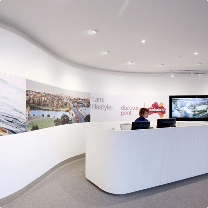
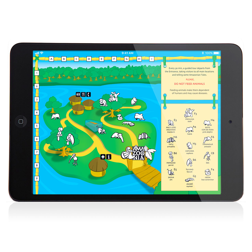
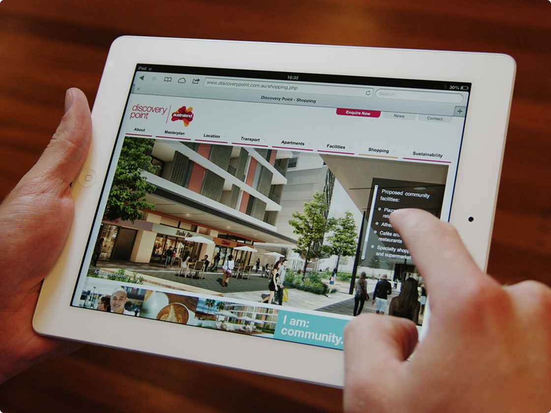
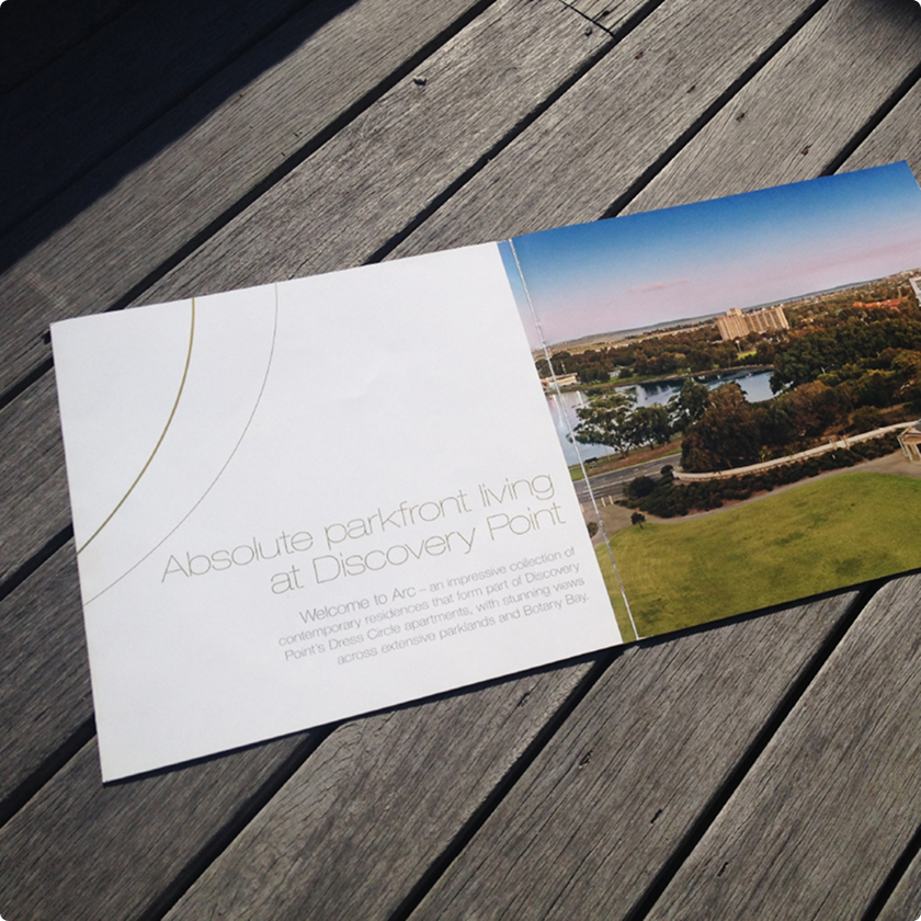
Discovery Point website on an iPad

AUSTRALAND :: Walking with giants

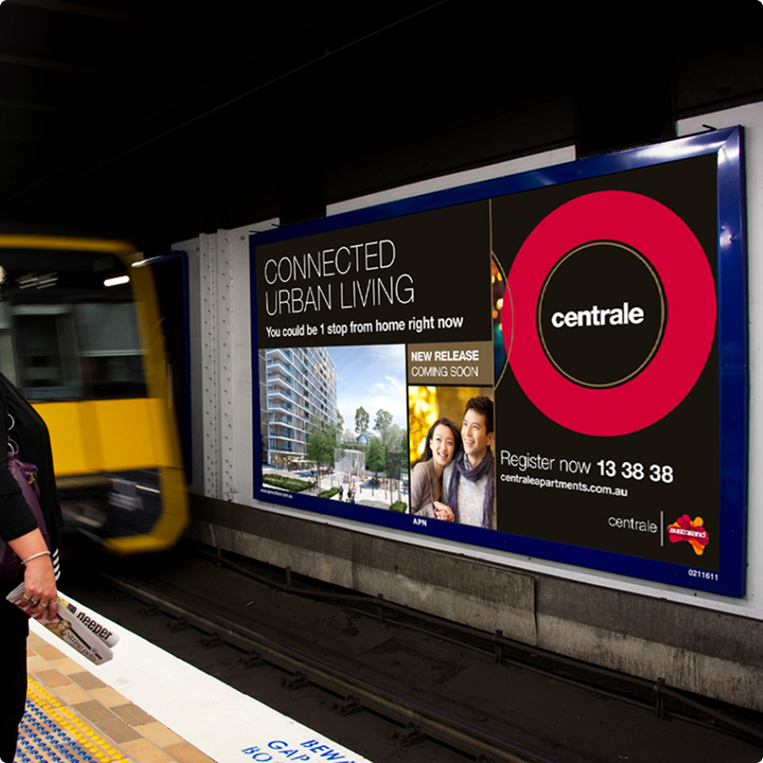
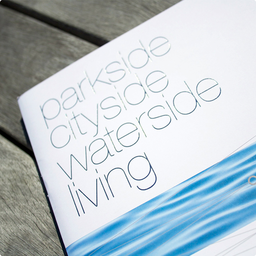
Every new Australand development needed a full wardrobe: name, tagline and logotype, brand guidelines, brochures, site hoarding, pre-sale suite screens, a Chinese-ready website, banners, emails, direct mail, bus shelters and airport screens, all before the concrete was dry. About ten launches at AMBA, each one starting from a blank page and a long list.

The process never changed: research, define, design, build, iterate, refine, repeat. I handled the digital side, from content strategy to working prototype, and helped write the manual so Australand's team could update dynamic ads themselves.

Every project matched or beat its sales goals, and when Frasers Property took over, the systems moved across with a bit of tweaking.
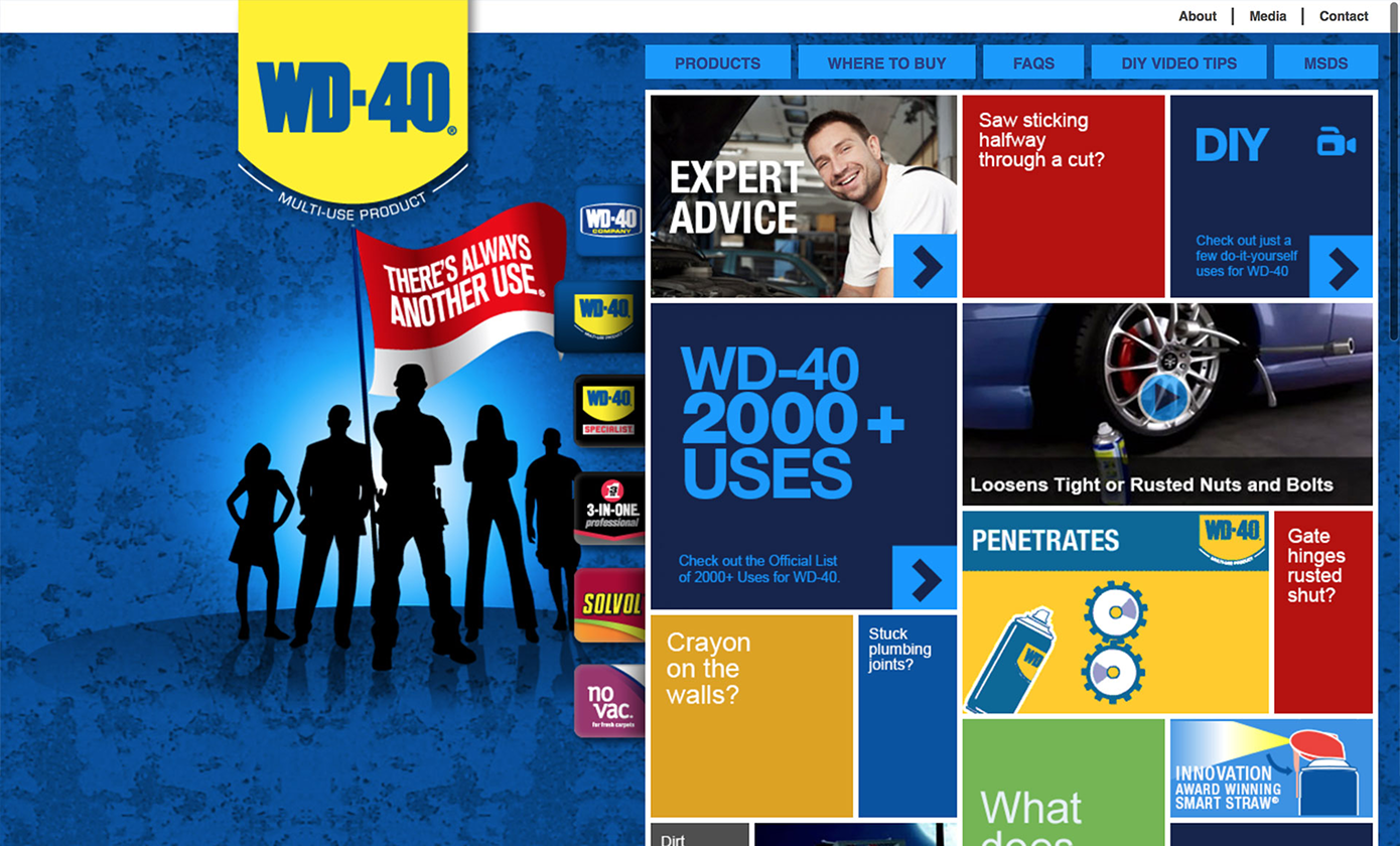
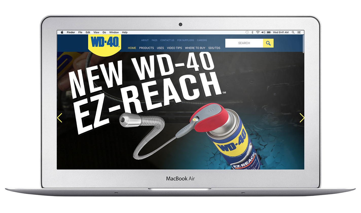
WD-40 website
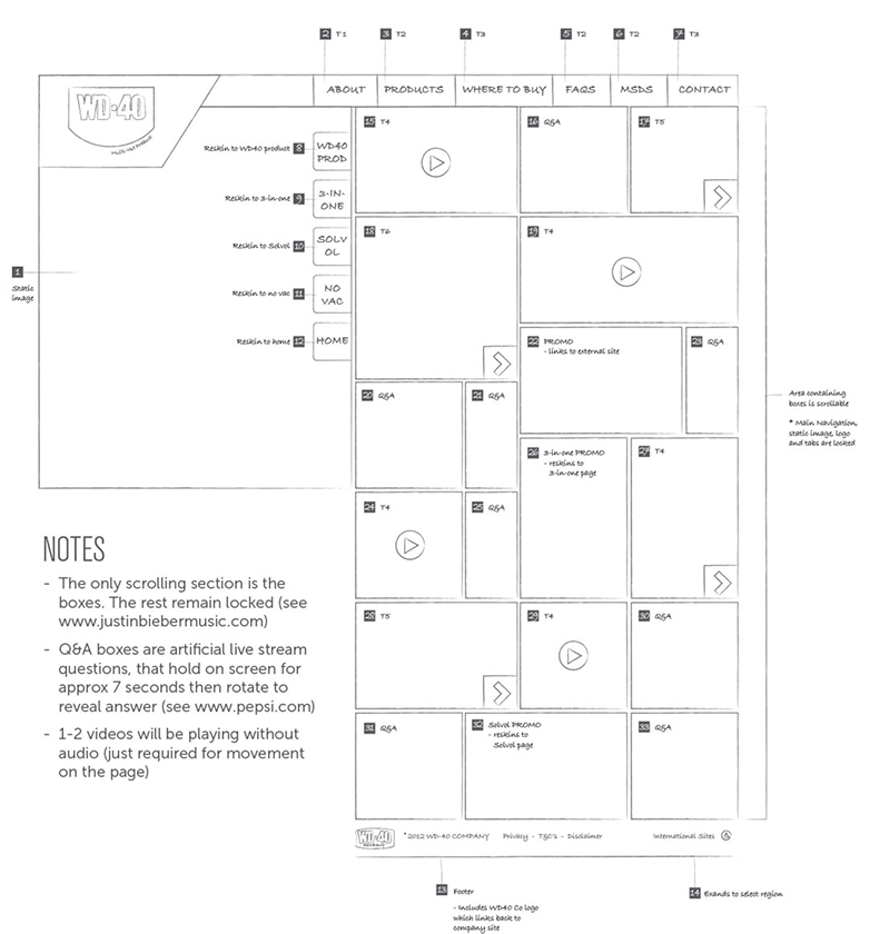
WD-40 website

WD-40 :: The making of a legend

A WordPress website for the brand behind the can that fixes everything. Coca-Cola and IBM were on WordPress, so why not us? Groundwork first: content inventories, competitor sitemaps and a keyword matrix, then wireframes and copy briefs, plus a board game for user-flow exercises and sticky notes that turned into Mondrians. Search traffic, returning visitors and time on site went up, and head office in the USA handed the Australian team the keys.
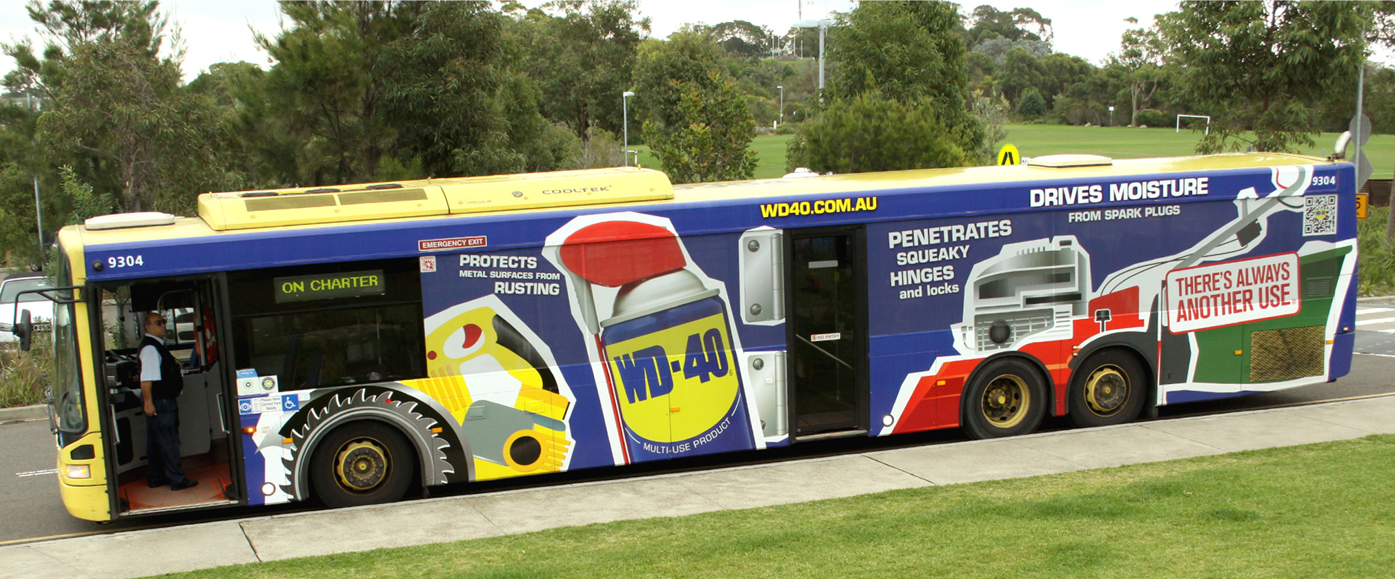
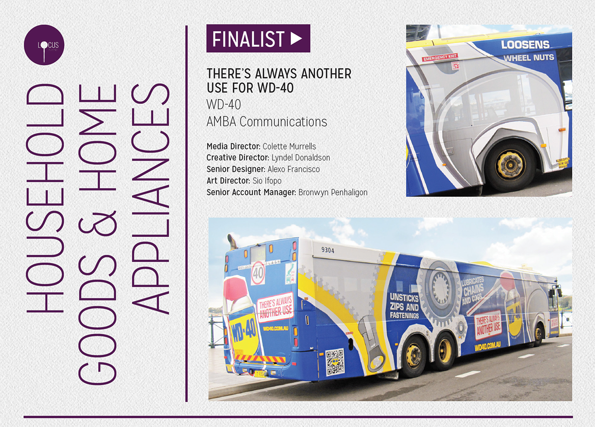
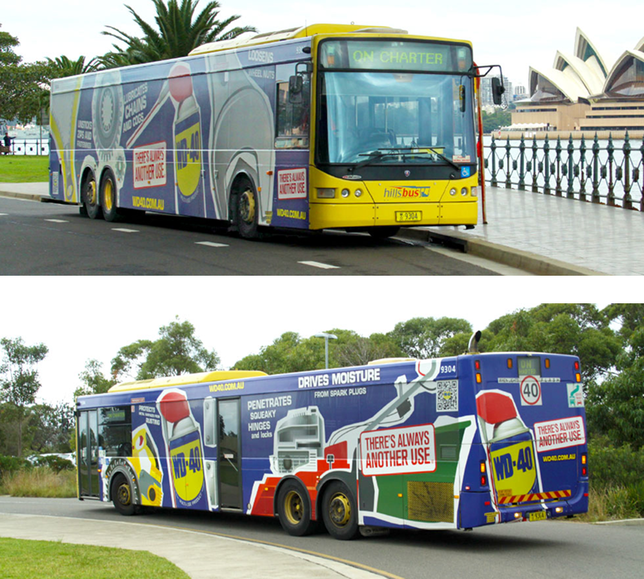
Then the can went outside: seasonal blue-and-yellow editions, point-of-sale, brochures, ads and an award-winning bus wrap. Same brand, same idea, just on a much bigger vehicle.

QANTAS :: Flying high

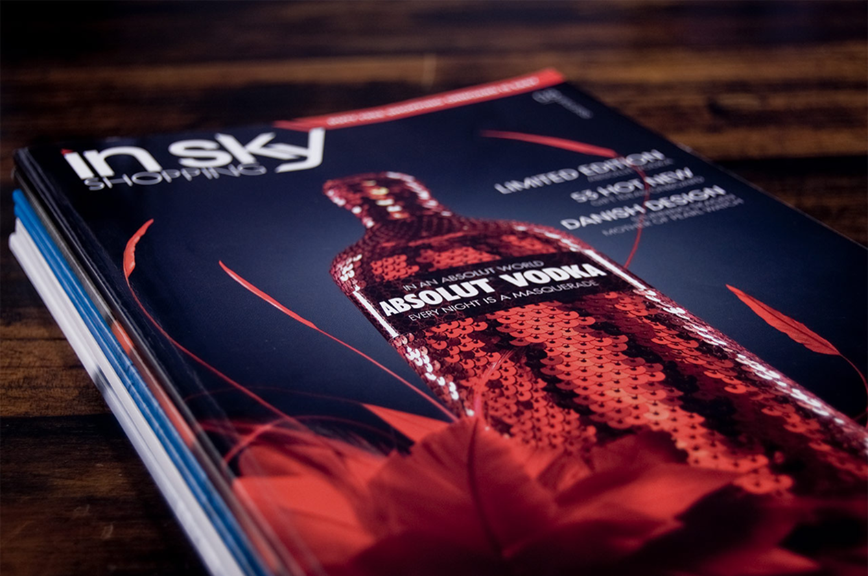
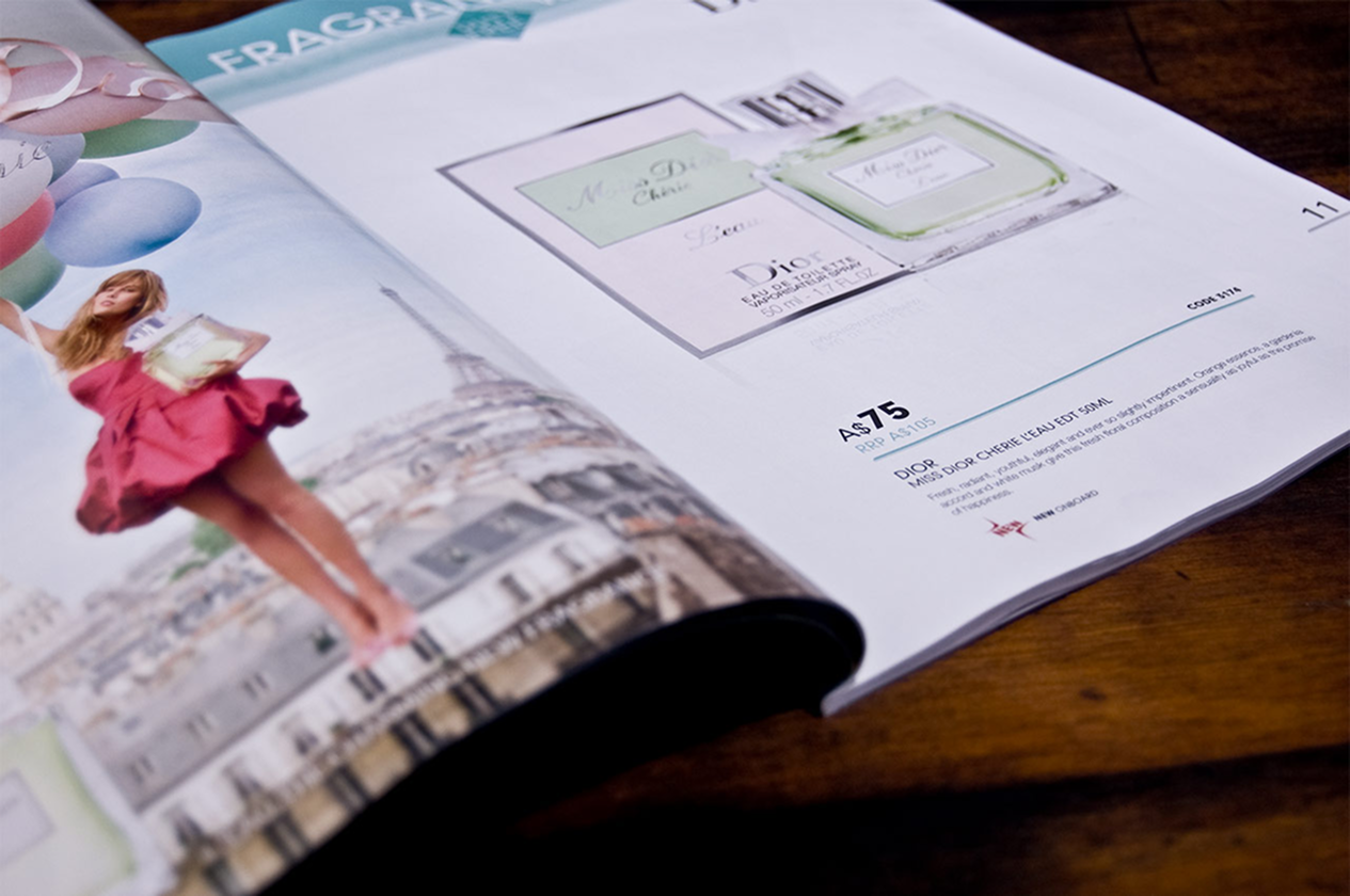
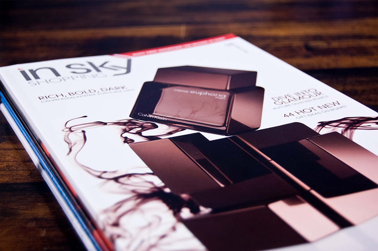
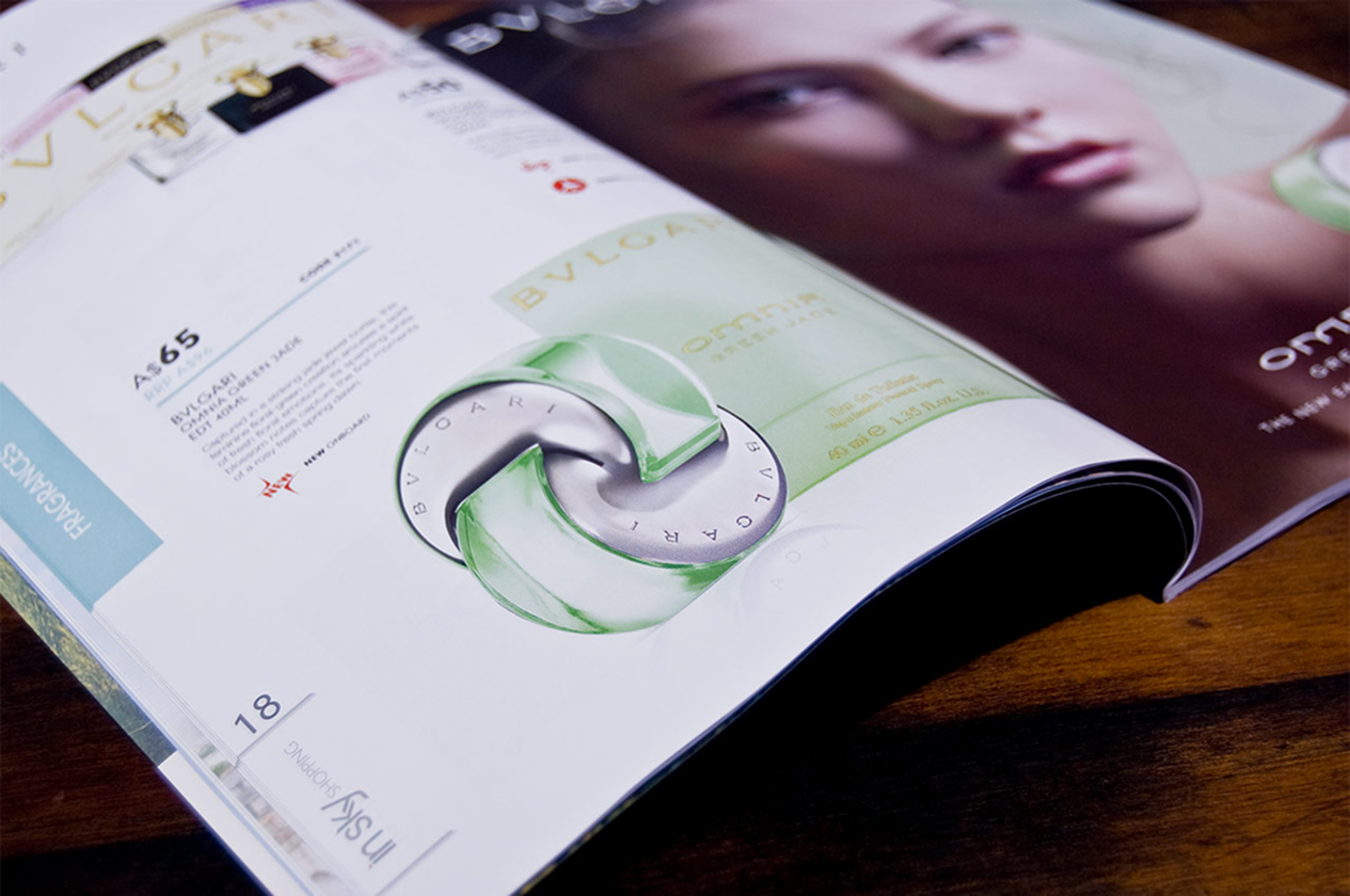
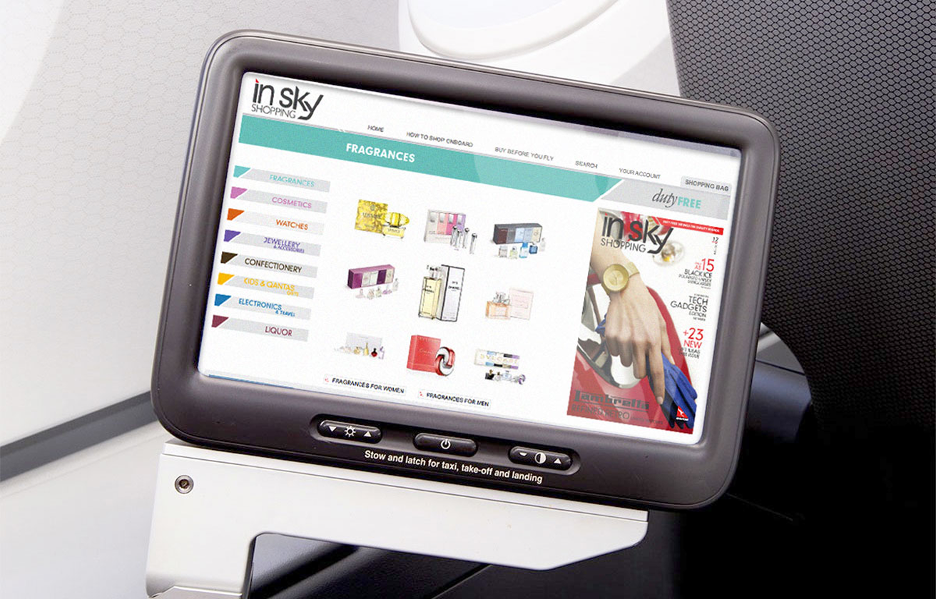
Duty free shopping, 35,000 feet up. The Qantas In-sky catalogue lived in three places, in print, online and onboard, so the art direction and production had to work in all of them. A captive audience, a lot of products and one chance per page to catch an eye without shouting. One system, three formats, and a lot of attention to what sits next to what.
KEY PHARMACEUTICAL :: The prognostic

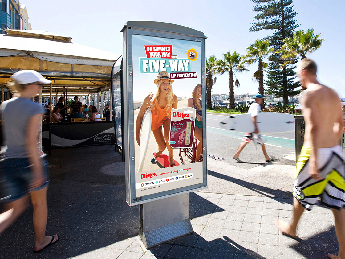
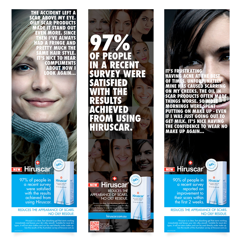
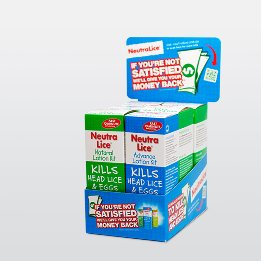
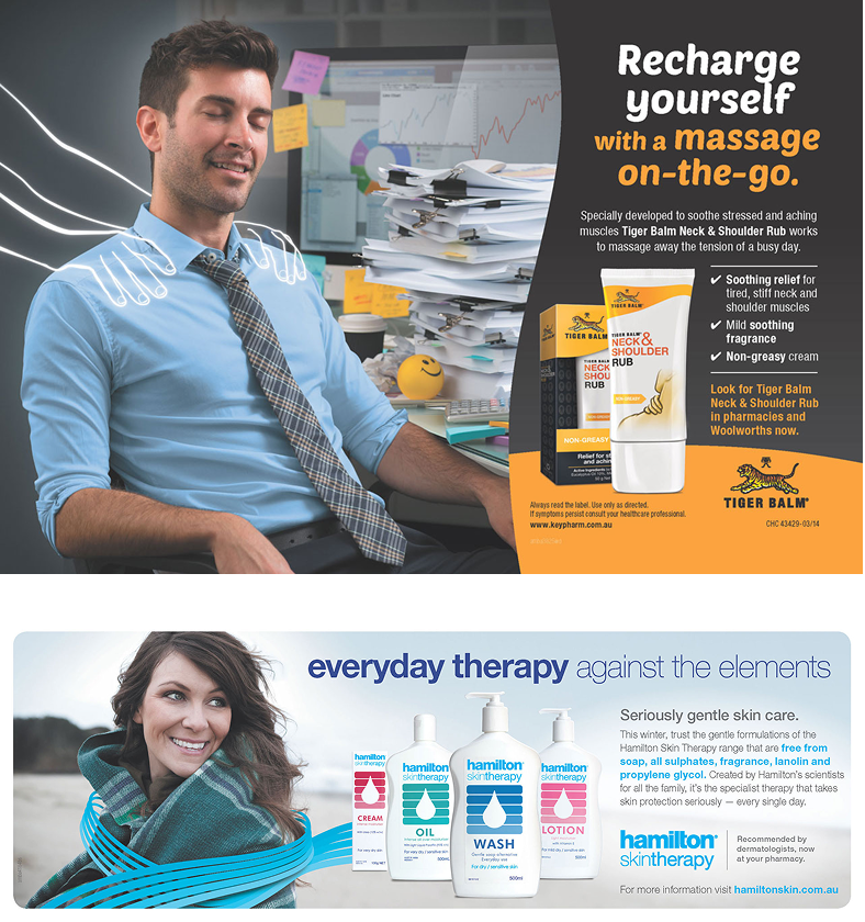
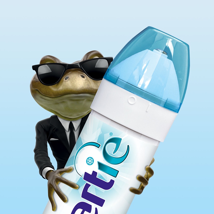
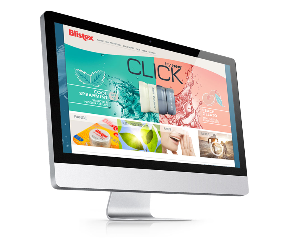
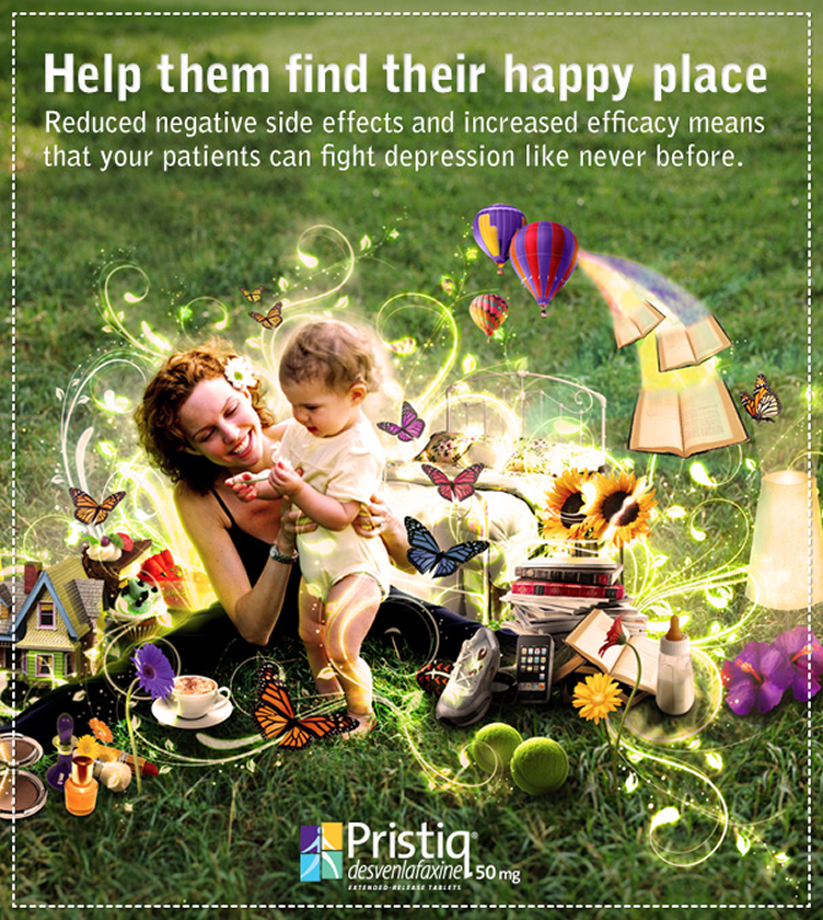
Brands this big need cohesion, legal sign-off and a message that still gets under your skin. Literally: Blistex, Mintec, Hamilton Sunscreen, Hirudoid. Every brief started with all the teams in one room and the market research on the table, then personas, flows and competitor matrices. Then the long run to handover: wireframes, prototypes, keyword sheets, social templates, copy briefs, style guides and integration tests for email, analytics and CRM. Blistex Click took it all the way: new packaging, point-of-sale, magazines, teen YouTubers, social, a website update, online ads and a 3D animation. Every campaign worked, and the client came back for more.

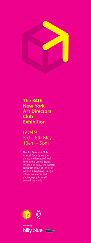
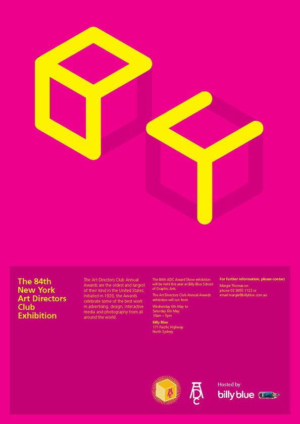
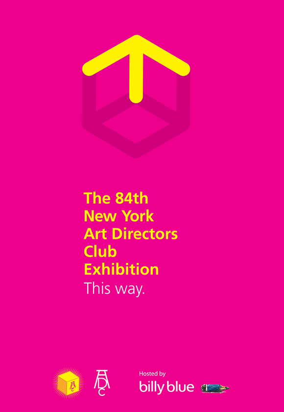
NYADC :: Golden corners

Typography for wayfinding during the exhibition of award finalists. Designing for designers.

PIXELATED :: Digital life

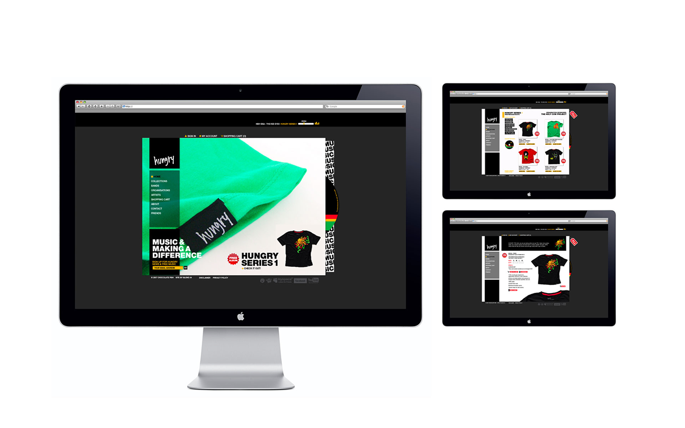
Designing with light. Screens of every size and everything that lives on them: websites, apps, animated ads, sales-aid presentations, interactive pieces, ebooks and email campaigns. One site built to serve two sunscreen brands. Amazoonia, where learning is fun. Tarkett's TarkoSpec, a specification tool made for designers. The routine barely changes: map the content, sketch the flow, wireframe it, prototype it in the browser, then hand it over so it keeps working without me in the room.