1+1>2
substance : : innovation : : pragmatism alex.francisco : : designer
substance : : innovation : : pragmatism alex.francisco : : designer
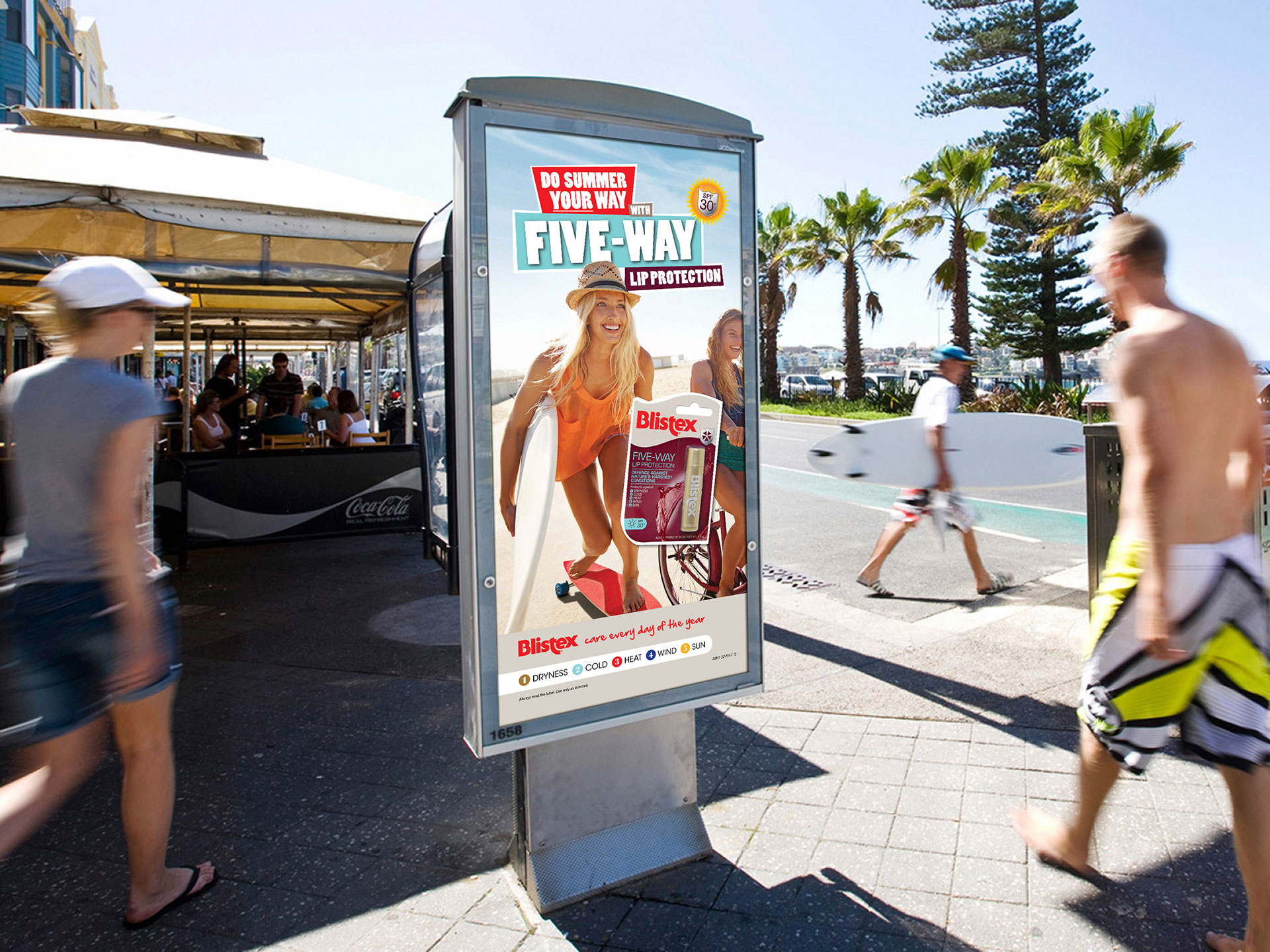
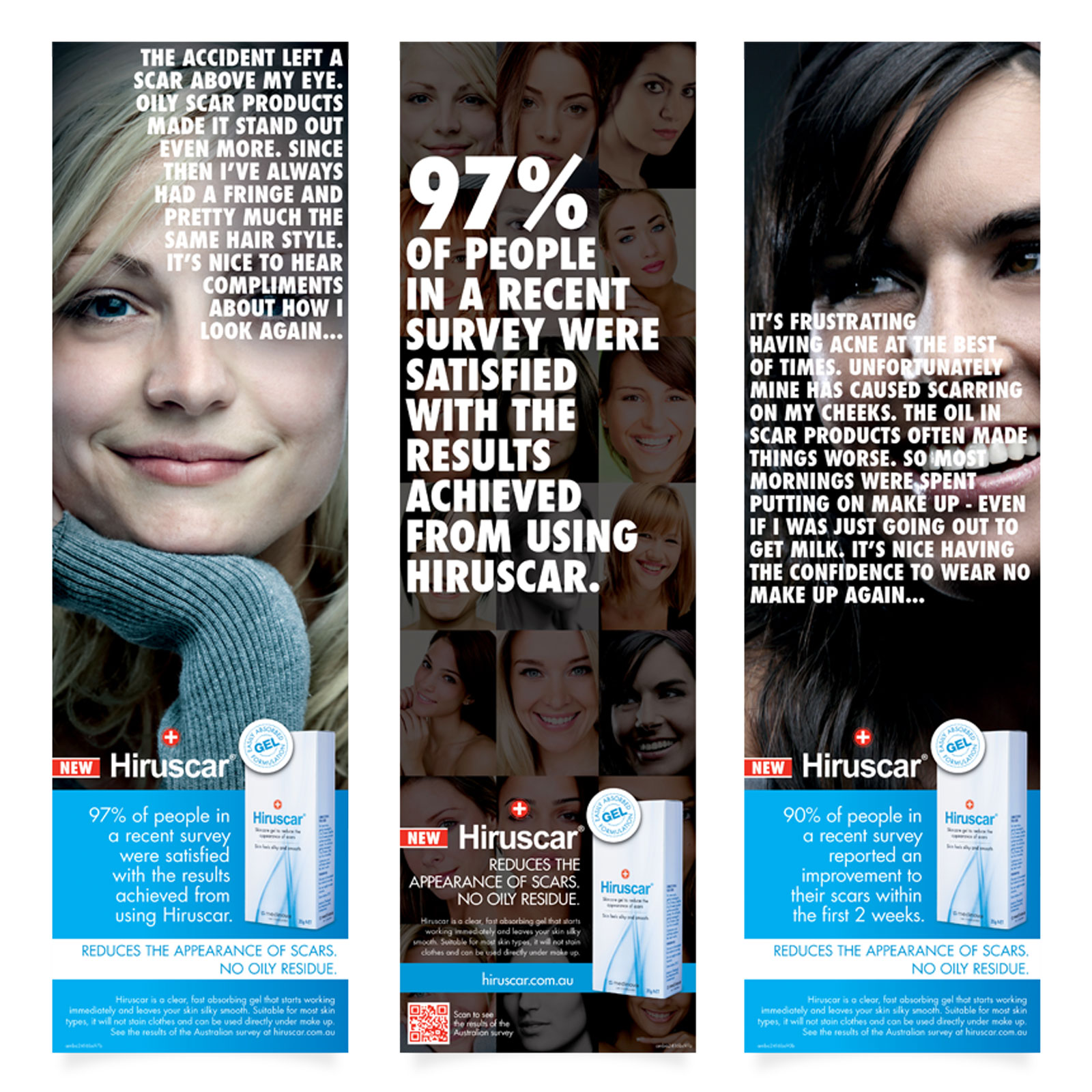
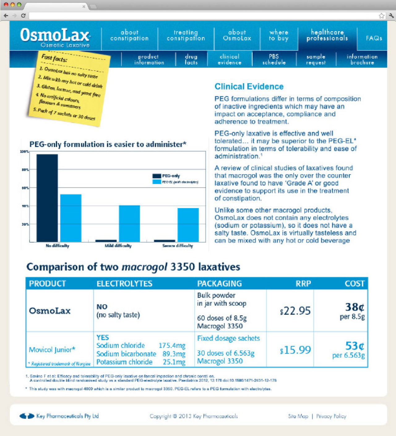
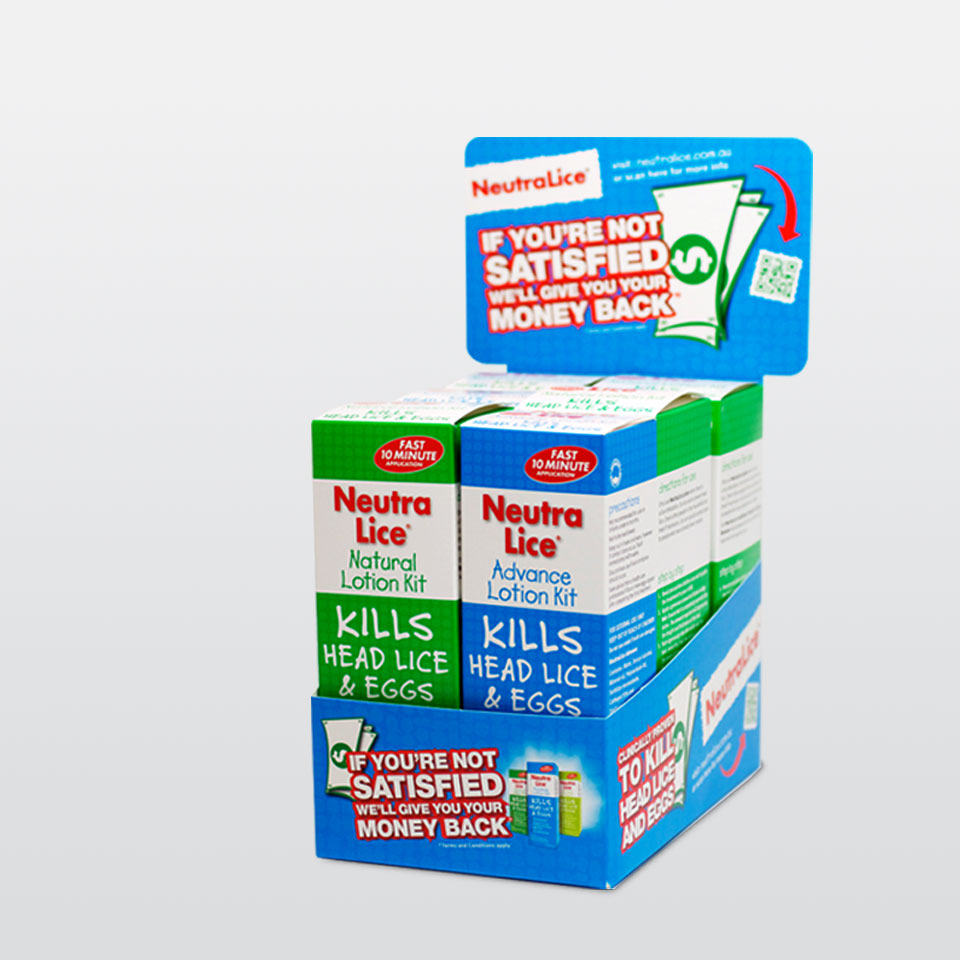
Pharmaceutical companies this big must put a lot of effort in brand and message cohesion as well as all the legalities while attending to global and local stakeholders’ requirements. With some of the most recognised brands in the market (Blistex, Mintec, Hamilton Sunscreen, Hirudoid and more…), Key Pharmaceuticals needed integrated solutions, based on extensive market research while still punchy enough to get under your skin. Literally.
Quite often we’d have a good amount of data from market research run by the company to be added to the exceptional industry knowledge our senior team members already had from a load of other projects our agency developed for Key Pharmaceuticals.We’d have goals set, leaning more and more to a user centred perspective. Making use of a user experience design tool box, we would sketch flows, contexts, personas, distil competitor analysis matrixes, quick glances on price strategy and even government agenda for some of the most advanced and innovative products.Having a digital designer to participate on those first session was regarded as very valuable. There was always a point to add on how the www could amplify the power of creative concepts, or new tools to be used to support advertising campaigns with conventional and guerrilla tactics. Also, the usual ‘Can we do this?’ question about new media, to which my answer would invariably be ‘ Yes, and…’
[Ps.: I can just picture the account manager waving frantically a purple Post-it with the word ‘BUDGET in capitals, pointing at me and graciously running her finger over her throat while holding her soy chai-latte without spill.]
[PPs: Account managers do have 4 arms.]
As part of the creative team, I’d leap in with my graphic designer helmet and help develop concepts, sketching from paper to PDF. It’s been noted, my drafts always featured a prominent space for an URL… Once we’re happy with the ‘substance’, it was time to bring in the ‘innovation’ and turn those clever headlines and crafty visuals into animated and interactive media. Roll up sleeves and here I’d put on my wireless headphones, press the HCD-empathy button, grab da cuppa, and start away with user journeys and flows, content strategy bullets, wireframe cards.Coffee. On to pixel perfect (jargon roll-eyes here…) Photoshop pages, interactive prototypes.Coffee. Then keyword spreadsheets, social media post templates, copywriting briefs.Coffee. Technical specifications and style guides for developers.Coffee. Finally to test integrations: email manager, analytics, inbound, CRM. Coffee. Handover. Coffee.
https://youtu.be/0OXIT8QMnQE
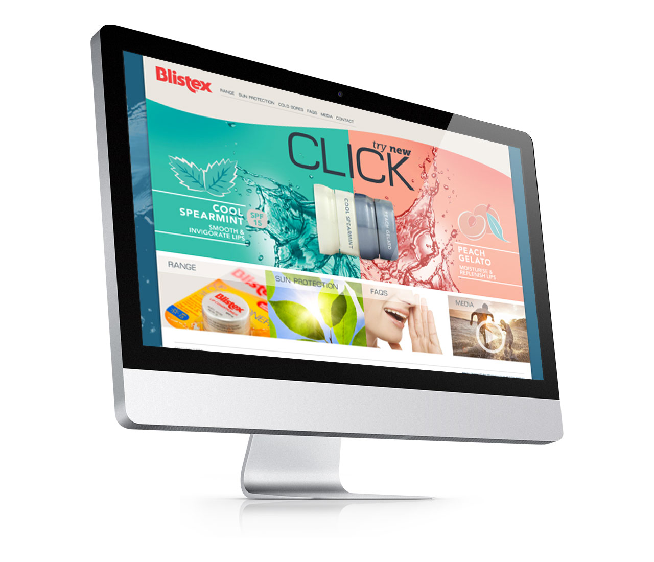
Every campaign was successful, with some going way beyond expected. One such case was Blistex Click, fully integrated, including:
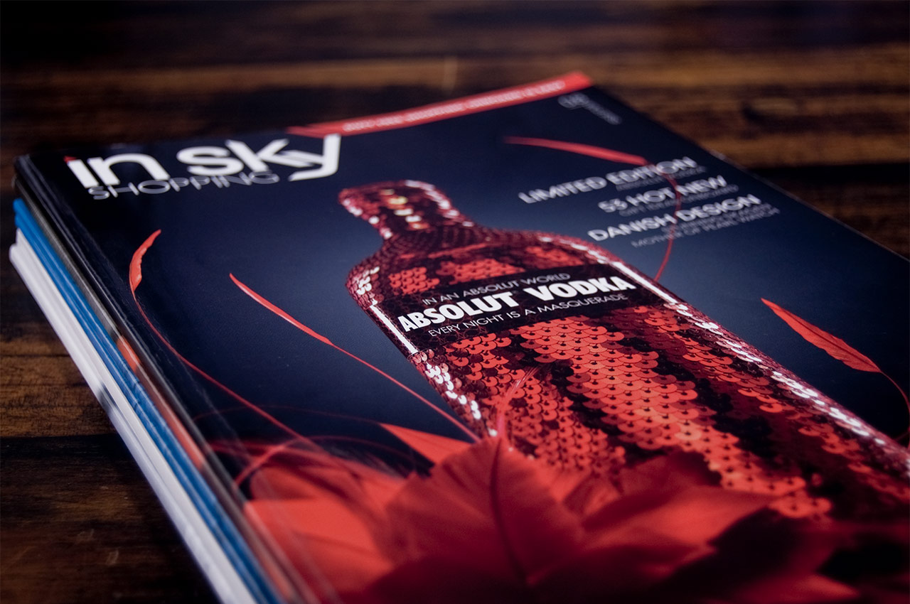
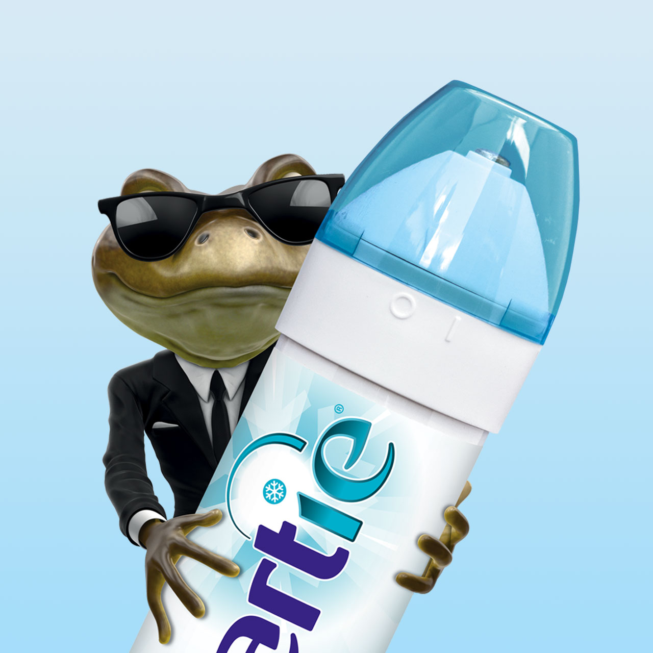
New packaging;Quite a few point-of-sale items;Printed advertising;Sponsored content on relevant magazines (female teenagers and young women audience);A couple of endorsements and reviews by YouTube teen stars;Social media posts and promotions;Website update;Online advertising campaign; and3D animation (website and YouTube call out).Well, sales went up about …% (think of a good number, then double it!). Market share penetration even higher, which for a well established product is always a priority metric.Client once again very happy, to the point where we could push it a bit and bring a well structured yet understandably conservative brand level marketing strategy to new grounds, developing new sales-aid presentations using a new technology we’ve been testing: d!NK (more about d!NK in other posts).It’s a win when your work is efficient and effective; it’s a huge win when because of consistency and innovation your clients partake in your hunger for putting new technology to good use.
AMBA Communications // Creative Team 2012-2016 Creative Director: Lyndel DonaldsonArt Director: Sio IfopoDesigner: Jason WattsDesigner: Aylin CelebiogluDesigner: Alex FranciscoFront-end Developer: Marvin Cho
