1+1>2
substance : : innovation : : pragmatism alex.francisco : : designer
substance : : innovation : : pragmatism alex.francisco : : designer
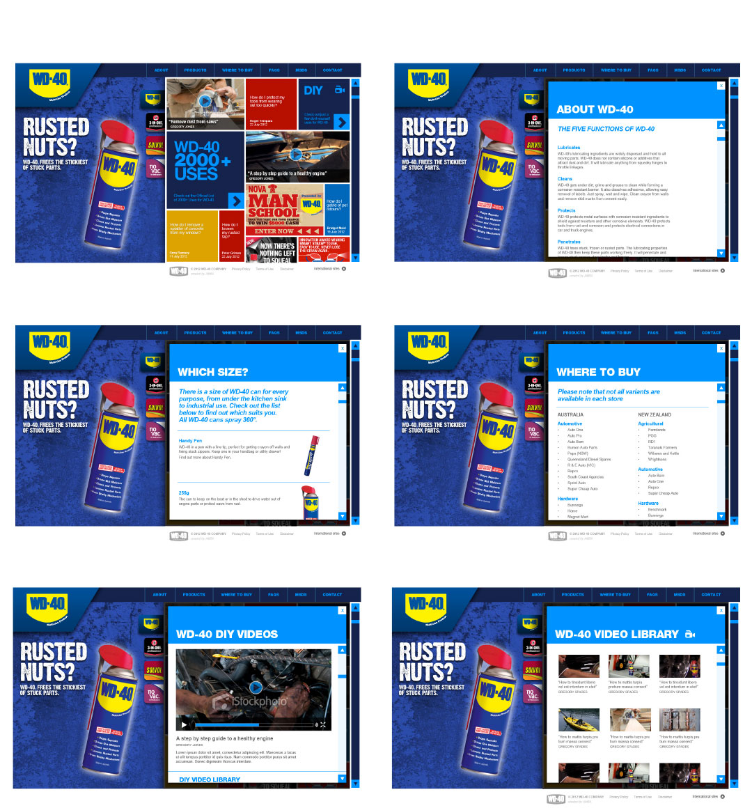
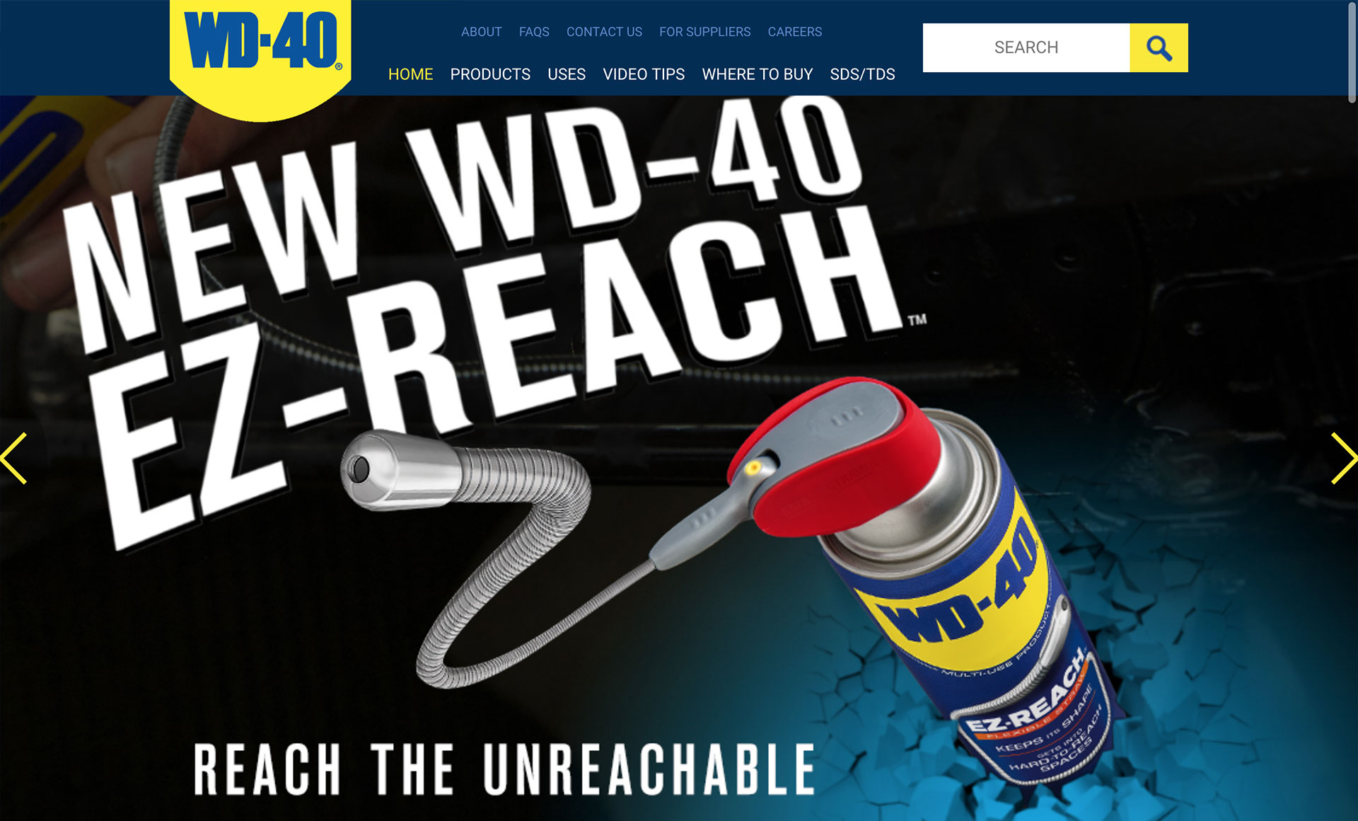
WD-40 Company and products website lift was my second job at AMBA Communications. It was in its early stages when I arrived, but the team had a good grasp of the content they wanted to include, what it should not be (boring...), and that it should be a WordPress website. Coca-Cola was doing it. IBM was doing it. We would do it too.
My role was to convert the extensive knowledge the creative and account management team had about the client, the product, and the audience into digital assets and strategy.
The agency had limited knowledge of digital products, so we started by having catalyst chats and quick over-the-shoulder workshops to familiarise everyone with the distinctions between traditional and new media. The in-house developer was the most excited about the cultural transformation, having been the only HTML-speaking person in the office until then. Introducing more exploration tools was fun. We created a sort of board game for user-flow exercises. A blast! Several of us also took on coloured sticky notes and Sharpies, turning walls into Mondrian-like insight displays.
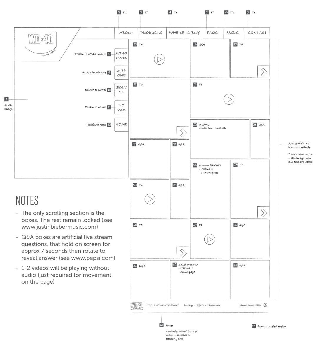
Once I collected enough information and felt that my systems were accepted and trusted, I moved on to the more technically demanding assets. I prepared templates for content inventory for WD-40’s previous and competitor websites, comparative sitemaps, and a keyword matrix. Working closely with the creative director, we devised a comprehensive content plan, which we then used for sitemaps, wireframes, and copywriting briefs.
Next came interface and interaction design. WordPress as a framework is quite accommodating, but since we were coming from a relatively humble digital culture, we opted for a simple website. We planned to save a few features, such as a video player, parallax animation, social media integration, and inbound marketing, for the near future – progressive disclosure turned on ourselves!
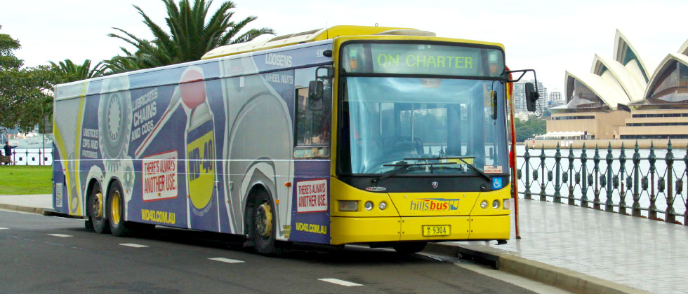
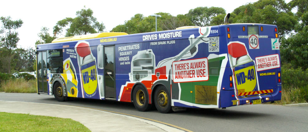
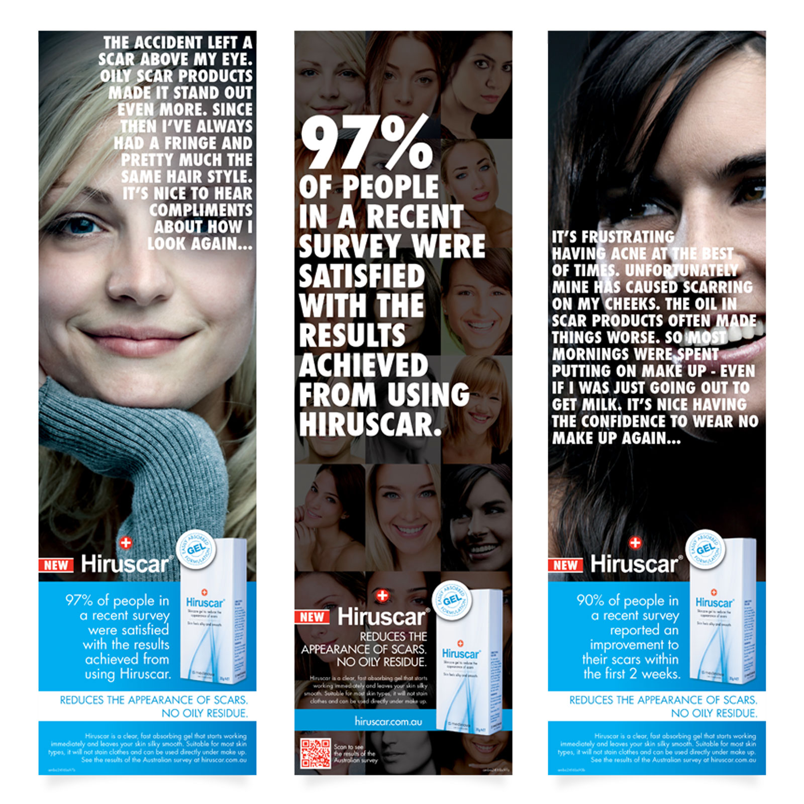
In parallel to the new website, a whole range of other communication assets were in production, such as point-of-sale displays, retail brochures, advertising campaigns, and even seasonal blue-and-yellow cans. But my favourite, by far, was the bus wrap. It's quite something to see your illustration wrapped around a bus cruising through town. It even got a few award nominations.
Win-win-win.
Win 1: The WD-40 Company was so thrilled with the process and outcome that, by the time the website was launched, we were already planning the next upgrade (which is the current version with content updates). We saw a significant increase in organic search, returning viewers, and time spent on the site. This very positive response led the headquarters in the USA to hand over complete control of the website to the Australia/New Zealand marketing team, lifting most of the restrictions we had before and allowing for a real ‘Aussie rules’ game.
Win 2: The agency grew stronger and more confident in delivering digital products. We now had our own dedicated digital team: an account/project manager, an in-house front-end developer, a back-end developer, and a digital designer – yours truly.
Win 3: From then on, I was included in every briefing session for campaigns with potential for digital media so that I could help identify opportunities as well as friction points for media-agnostic concepts.
AMBA Communications // Creative Team 2012-2016 Creative Director:* Lyndel Donaldson Art Director:* Sio Ifopo Designer:* Jason Watts Designer:* Aylin Celebioglu Designer:* Alex Francisco Front-end Developer:* Marvin Cho Back-end Developer:* Luke Stevenson
